A modern, responsive boilerplate laid bare.
DownloadAll while keeping what made Skeleton great:
Is Barebones for you?
You should use Barebones if you're embarking on a smaller project or just don't feel like you need all the utility of larger frameworks. Barebones only styles a handful of standard HTML elements and CSS Grid, but that's often more than enough to get started.
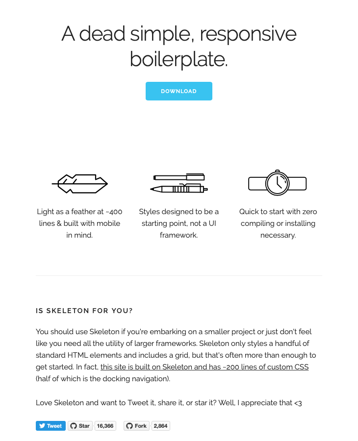
In fact, while this looks like the original Skeleton site, it's made using Barebones, allowing lighter html and more flexible CSS. Barebones also includes support for legacy Skeleton sites without changes.
Use Barebones and want to lay yourself bare? Let others know!
TweetThemes
CSS Variables allow Barebones to maintain it's independence on additional tools such as CSS preprocessors SCSS or Less, while gaining centralized management of global values. This allows for much easier theming and rebranding.
The default theme maintains the color choices from Skeleton, although a few very similar colors were consolidated. Colors are based from a theme hue, which defines the normal text color. Additional richer and softer text colors are then defined.
The choice of those keywords is to prevent confusion with light vs dark themes. For example. in a light background theme, softer would mean a lighter color than normal, ie less contrast with the background, but if the base hue is dark, softer would be darker to decrease the contrast.
/* default theme: light background, dark text, blue accent */
--theme-hue: 0;         /* white */
--accent-hue: 194;      /* blue */

--text-color-richer: hsl(var(--theme-hue), 0%, 5%);      /* #0d0d0d    */
--text-color-normal: hsl(var(--theme-hue), 0%, 13%);     /* #222222     text color; button:hover:focus color */
--text-color-softer: hsl(var(--theme-hue), 0%, 33%);     /* #555555     button color; button:hover border */

--accent-color: hsl(var(--accent-hue), 86%, 57%);        /* #33C3F0     link; button-primary bg+border; textarea,select:focus border */
--accent-color-hover: hsl(var(--accent-hue), 76%, 49%);  /* #1EAEDB     link hover; button-primary:hover:focus bg+border */

--border-color: hsl(var(--theme-hue), 0%, 73%);          /* #bbbbbb    button border */
--border-color-softer: hsl(var(--theme-hue), 0%, 82%);   /* #d1d1d1    textarea,select,code,td,hr border   */

--background-color: white;                               /* transparent body background; textarea,select background */
--background-color-softer: hsl(var(--theme-hue), 0%, 95%);
--code-background: hsl(var(--theme-hue), 0%, 95%);       /* #f1f1f1     code background*/

--button-primary-color: white;
A dark theme is included in Barebones inside a prefers-color-scheme: dark media selector. This is a new selector not widely supported by browers yet, but demonstrates a second theme.
You can use the buttons below to switch between these themes
Grids
Barebones replaces the fixed 12-column grid with CSS Grid: a more flexible and powerful foundation supported natively in CSS. If you've ever fought a Flexbox layout to do what you want, you'll probably find CSS Grid a lot easier to work with as it was designed specifically for laying out in two dimensions.
Barebones only includes a few basic layouts, but note the Fifths wouldn't be easy with the 12-column layout.
	Halves
	Halves


	Thirds
	Thirds
	Thirds
	Thirds
	Thirds
	Thirds
There's a lot of possibilities with CSS Grid and great resources available without repeating a how-to guide here.
Typography
Type is all set with the rems, so font-sizes and spacial relationships can be responsively sized based on a single <html> font-size property. Out of the box, Barebones never changes the <html> font-size, but it's there in case you need it for your project. All measurements are still base 10 though so, an <h1> with 5.0remfont-size just means 50px.
The typography base is Raleway served by Google, set at 16rem (16px) over a 1.6 line height (24px). Other type basics like anchors, strong, emphasis, and underline are all obviously included.
Headings create a family of distinct sizes each with specific letter-spacing, line-height, and margins.
Heading <h1> 50rem
Heading <h2> 42rem
Heading <h3> 36rem
Heading <h4> 30rem
Heading <h5> 24rem
Heading <h6> 15rem
Heading
Heading
Heading
Heading
Heading
Heading


The base type is 15px over 1.6 line height (24px)


Bolded
Italicized
Colored
Underlined
Buttons
Buttons come in two basic flavors in Barebones. The standard <button> element is plain, whereas the .button-primary button is vibrant and prominent. Button styles are applied to a number of appropriate form elements, but can also be arbitrarily attached to anchors with a .button class.
Anchor button
Anchor button
Forms
Forms are a huge pain, but hopefully these styles make it a bit easier. All inputs, select, and buttons are normalized for a common height cross-browser so inputs can be stacked or placed alongside each other.
Lists
- Unordered lists have basic styles
-
They use the circle list style
- Nested lists styled to feel right
- Can nest either type of list into the other
- Third Level Lists work as well
- How low can you go?
- Just more list items mama san
- Ordered lists also have basic styles
-
They use the decimal list style
- Ordered and unordered can be nested
- Can nest either type of list into the other
- Last list item just for the fun
- Item 1
-
Item 2
- Item 2.1
- Item 2.2
- Item 3
One change from Skeleton is that font-size does not decrease with nested lists, instead using the --text-color-softer variable for nested list color. This allows deeper nesting without readability problems.
Code
Code styling is kept basic – just wrap anything in a <code> and it will appear like this. For blocks of code, wrap a <code> with a <pre>.
.some-class {
  background-color: red;
}
.some-class {
  background-color: red;
}
Tables
Be sure to use properly formed table markup with <thead> and <tbody> when building a table.
| Name | Age | Sex | Location |
|---|---|---|---|
| Dave Gamache | 26 | Male | San Francisco |
| Dwayne Johnson | 42 | Male | Hayward |
      Name
      Age
      Sex
      Location


      Dave Gamache
      26
      Male
      San Francisco


      Dwayne Johnson
      42
      Male
      Hayward
Media queries
Barebones uses media queries to serve its scalable grid, but also has a list of queries for convenience of styling your site across devices. The queries are mobile-first, meaning they target min-width. It means all styles outside of a query apply to all devices, then larger devices are targeted for enhancement. This prevents small devices from having to parse tons of unused CSS.
Barebones makes some changes to Skeleten's default break points, based on personal experience and some really good rational. The sizes for the queries are currently:
- Desktop HD: 1200px
- Desktop: 900px
- Mobile: 600px
With the upcoming env() variables in CSS, Barebones will be updated to make media queries top level variables to easily change breakpoints as desired.
/* Mobile first queries */

/* Larger than mobile (default point when grid becomes active) */
@media (min-width: 600px) {}

/* Larger than phablet */
@media (min-width: 900px) {}

/* Larger than tablet */
@media (min-width: 1200px) {}
Utilities
Barebones has a number of small utility classes that act as easy-to-use helpers. Sometimes it's better to use a utility class than create a whole new class just to float an element.
/* Utility Classes */

/* Make element full width */
.u-full-width {
  width: 100%;
  box-sizing: border-box; }

/* Make sure elements don't run outside containers (great for images in columns) */
.u-max-full-width {
  max-width: 100%;
  box-sizing: border-box; }

/* Float either direction */
.u-pull-right {
  float: right; }
.u-pull-left {
  float: left; }

/* Override default content alignment */
.u-align-left {
	text-align: left; }
.u-align-right {
	text-align: right; }

/* Clear a float */
.u-cf {
  content: "";
  display: table;
  clear: both; }
Legacy Support
If you have a site originally build with Skeleton and want to migrate to Barebones without breaking everything at once, we'll help you keep those skeletons hidden in the closet. Simply include the skeleton-legacy.css file to provide backwards compatibility for all classes removed from Barebones.
The legacy classes, which mostly applied to grids, have been updated to use Barebone's CSS Variables and CSS Grid system so any overall changes will still be applied across the entire site. See below for a demo using the html from the original Skeleton site styled with Barebones and legacy css.
Resources
Links to resources for some of the newer features used in Barebones and some of the up and coming standards with included support:
CSS Variables
CSS Grid
Up and Coming Standards

